
|
|
|
 |
As you know, I'm a designer. That also means I examine things with a designer's eye. Whether it's architecture, fashion, graphics, etc., I'm looking deeper to see what the meaning and story is beyond just the superficial. (ok, that sounds a little pompous... let's move on) I love when people put in some truly brilliant and creative thought in designing both the avant garde and the everyday. Recently, I stumbled across a fun little graphic. It shows the highway shields that each state uses for their individual state routes.  Click to enlarge Editor's note: I can't confirm the original source of this image, but Reddit seems to be the frontrunner. A few states have embraced the challenge of designing something functional, yet personal and with character. Most, however, totally mailed it in. A plain white square with a number? Yawn. But I'm not going to focus on those guys, I'm going to spotlight a few of the true winners. Gold Medal: New Mexico At quick glance, the Land of Enchantment looks like one of the boring states. But when you take a moment to really see it, you can spot the brilliance. New Mexico has deftly incorporated their state flag into the design, and it's real slick. 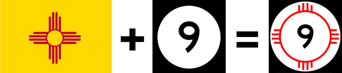 Colorado is the only other state to use their flag on their shield, but they just put the flag on top of the number in a rather ham-fisted way. New Mexico is subtle but impactful. It doesn't overburden the shield, and shows true design thinking. Silver Medal: Utah Utah, as a square state, could have easily put a number within the outline of their state, like Arkansas or Nevada or South Dakota (to name a few), and call it a day. However, they decided to do something a little more personal. Much like California is the Golden State and New York is the Empire State, Utah is the... Beehive State.  Yup, that's a beehive. Having actually driven in Utah, I can confirm that they are quite eye catching because they are visually different. Of course, if you didn't know the beehive connection, they might appear to be just plain weird. But I applaud that they didn't take the easy way out, and put a little fun in their design. Bronze Medal: Kansas Kansas, as well, looked to their state nickname for inspiration. Kansas is the Sunflower State, and while using a sunflower silhouette instead of a plain circle is a smart choice, the real kudos is the use of color. The yellow sunflower on a dark blue background really pops, especially compared to everyone else's black and white doldrums.  While Wyoming also uses a yellow sign (and some may joke that the sign is shaped like the state), it feels cumbersome and looks like a roadside caution sign. Kansas is sweet and simple, but makes it standout. The point I'm trying to make here is that you don't have be boring and you don't have to over-design in order to bring a idea to life. Some will argue for form. Others will argue for function. I'm here tell you there is a third way. It's all about striking that right balance between the two, and these winning states are showing it can be done. And yes, you should have made that left at Albuquerque. |
 Thanks for visiting. Love, Demosthenes Spiropoulos |